Top Tips for Designing a Menu
Author:
Adam Prew
Published: 12/09/2013
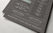
The design of a restaurant's menu is fundamental to creating the perception customers have about the food served there, and as such should be an extension of the restaurant's ethos.
First impressions do count and often the menu is your first opportunity to shout about the restaurant. Make an impression that counts.
Content
A clean and simple design can work perfectly for a stylish and contemporary restaurant looking for people to spend a relaxing evening out, but something like a takeaway menu needs to try and get customers to order before they've even seen inside the establishment.
So plan the content of your menu carefully before starting work on the design. There's nothing worse than laying out a whole menu, and then having to cram in those five dishes you forgot to include the first time round. Often this can throw out the overall layout out and make the finished piece look unprofessional.
Break down sections using clear sub-headings and containers and make the prices and any important information regarding ingredients easy to read. Tailor the language of your menu to your audience, and let the passion you put into your food show in the descriptions of each dish to get people excited and wanting to try your food. Using the language of the country your recipes come from helps the customer have a more authentic experience, but make sure it's easy for people to see what's in each dish without having to keep calling the waiter over!
Layout
Layout is key to designing an effective menu - make sure you leave lots of blank space around the text to make it easily legible. You may have to produce a separate menu for drinks and desserts to accommodate this, but it's a good investment to ensure your restaurant's brand is professional and show it's serious about its food. The last thing you want is customers saying they can't read the menu, so use simple, clear fonts throughout to make reading it an enjoyable experience.
Images
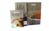
Photography can help tempt people to visit you or order a takeaway, but once people are in the door, it shouldn't feature on the menus you use inside as they can cheapen the look and feel of the restaurant. Using photos taken on your camera phone isn't going to tempt someone to order from you, so invest in some mouth-watering photography that really shows off your creations in the kitchen.
Finally
Pay attention to spellings and grammar and don't scribble out prices and re-write them if they've changed. If this is the case, it's time for a new print run, so gauge feedback on what worked and what didn't and update the artwork where applicable for your next set of menus.


